Something that’s been catching my eye in the market data in recent months is the lack of new listings coming to market, especially as we enter the full swing of the spring market.
This trend has had some knock-on effects, such as slower sales (since you can’t sell what’s not listed), and I’ve noticed “housing pundits” everywhere offering various theories and explanations – many of which seem entirely plausible but tend to rely heavily on anecdotal evidence (e.g., “My client isn’t listing because they can’t find another place to buy”, etc.).
I’m sympathetic to anecdotal evidence because I think people’s on-the-ground experience is always valuable and well-worth considering. The trouble with anecdotal evidence, however, is that it can be hard to summarize into a good chart.
And, well, I’m a sucker for a good chart. And this blog is all about charts!
So, why don’t we add some context to this discussion by starting out with one such chart?
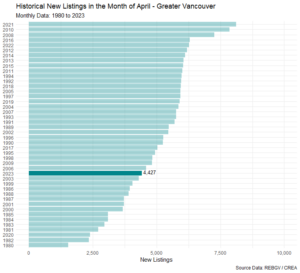
Here’s a plot of new listings in every month of April for Greater Vancouver, going all the way back to the 1980s. I’ve ordered the tallies of new listings from largest to smallest (labeled by year) so that it’s easier to get a sense of where the current pace of new listings ranks in a historical perspective.

We’re not quite at the lowest level for April in history, but we’re ranking 15th from the bottom, which isn’t quite as high as we’ve seen in the recent past. And if your brain works anything like mine does, you might be wondering what the cause(s) behind this trend could possibly be.
I’ll get to my working theory on that in a minute, but first some preamble and (surprise!), more charts.